Thesis: The presentation of sea ice in TAR4 used only a sub-set of the data. It should use a wider range of data with reference both to data which were available at the time of TAR4, and data which have become available since.
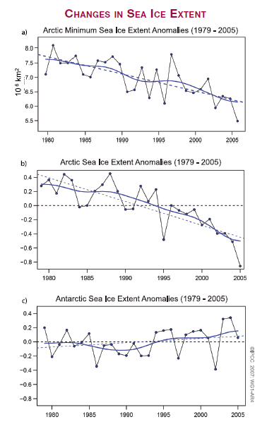
The technical summary presents the following set of graphs:
The way the graphs are presented is reminiscent of graphs of return on investment of rivals presented by some of the less honest financial intermediaries. Those for the Arctic are presented as anomalies with a scale set so that the full range fits in the rectangle and it seems as if ice extent has fallen close to zero. For the Antarctic, where the area of ice has been tending to increase, they have used the same scale which conveniently minimises the increasing tendency of Antarctic ice.
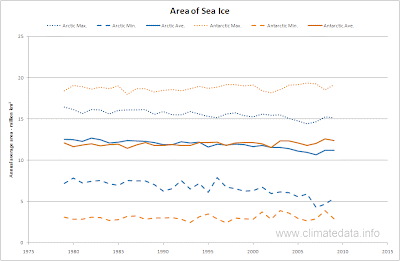
The following graph presents the same data, updated to May 2010, but as extent not anomalies.
This very clearly shows that on average there are similar areas of sea ice in the Arctic and Antarctic, that the variation is much larger in the Antarctic than the Arctic and the loss of sea ice in the Arctic is only partially balanced by the gain in the Antarctic. A linear regression through the average values suggests that the Arctic has lost 50,000 km2 per year whereas the Antarctic has gained 14,000 km2 per year. The average total area of sea ice 23.9 million km2 so this loss represents a rate of 0.15% a year.
The Synthesis Report also mentions the break-up of the Larsen B ice shelf. This was an area of ice partly floating and partly resting on land and joined to the main Antarctic ice shelf. It was located on the most northerly (i.e. warmest) point of the Antarctic. The area of the ice shelf was 3250 km2 and its weight was 72 billion tons. The loss of the ice shelf has become iconic and it has been compared to the area of Rhode Island or to the trillions of 20 lb bags which could be filled (though not in the IPCC report). In relation to the area of the Antarctic ice sheet it represents only 0.02% of the area or 0.003% of the volume.
The Synthesis Report also mentions the break-up of the Larsen B ice shelf. This was an area of ice partly floating and partly resting on land and joined to the main Antarctic ice shelf. It was located on the most northerly (i.e. warmest) point of the Antarctic. The area of the ice shelf was 3250 km2 and its weight was 72 billion tons. The loss of the ice shelf has become iconic and it has been compared to the area of Rhode Island or to the trillions of 20 lb bags which could be filled (though not in the IPCC report). In relation to the area of the Antarctic ice sheet it represents only 0.02% of the area or 0.003% of the volume.
We do recognise that the minimum area of sea ice is a useful metric. The albedo (reflectivity) of ice is high and that of sea water is low. In summer, when ice is at a minimum and sunlight at a maximum, the albedo effect is important and the fears that the low Arctic minimum of 2007 could lead to a progressive reduction in sea ice area were valid.
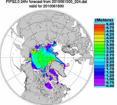
At the time of the TAR4 there was little information available on ice depth and volume. From October 1998 daily values of ice thickness are available from the US Navy polar ice prediction system(PIPS). The forecast values of ice thickness use weather forecasts, and buoys and ice concentration data from the Special Sensor Microwave Image (SSM/I) are used to initialize the system's forecast. The results are available as GIF images. A typical one is given below.
To derive areas and volumes the graphic images were downloaded analysed. The projection used is not an equal area project so the areas derived were approximate. They were based pro-rata on a scanned image of Greenland. During the analysis it was found that the colours representing thickness range 0.5 to 0.75 were never present. It should also be noted that occasionally there were anomalous values, for example for a few days the Caspian and Aral seas were included.
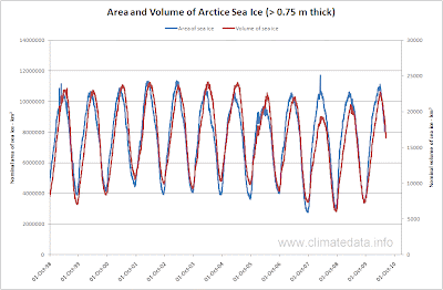
The following graph shows the area and volume of sea ice from October 1998 to May 2010. These figures only apply for ice greater than 0.75 m thick and consequently the areas are less than those of ice extent in the above graph.
The following graph shows the area and volume of sea ice from October 1998 to May 2010. These figures only apply for ice greater than 0.75 m thick and consequently the areas are less than those of ice extent in the above graph.
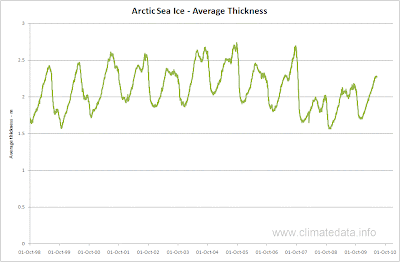
In general the volume and area show similar variation but after the low summer minimum of 2007 the ice area recovered well in 2008 but the volume. This is reflected in the chart on ice thickness.
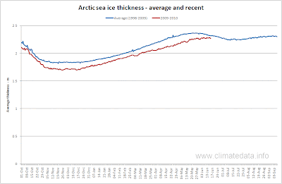
This shows that minimum ice thickness was less in 2008 than in 2007, giving some support to those who said the ice that year was “rotten”. It is interesting to note that the ice thickness is bi-modal; one maximum occurs in May when the ice area has just passed its maximum and the second in September near to the point when it is at its minimum. This can be seen more clearly in the following graph where compare average thickness with current ice thickness.
The shape of the graph suggests that ice thickness is belatedly reaching its spring maximum. How it will develop in the coming months is something we will follow with interest. What these graphs do show is that Arctic sea ice is recovering in terms of volume, are and thickness.
In these “theses” we generally do not concern ourselves with short term effects so to counter that remember that during the last inter-glacial sea levels were 6 m higher than at present. Although melting sea ice does not affect sea levels we can none-the-less expect more melt independent of any anthropogenic effect.
IPCC TAR5: The presentation of graphs data in TAR5 was biased to give an exaggerated impression of ice loss. In TAR5 the presentation should be more balanced. It should use a wider range of metrics to assess changes in sea ice.
